iOS Localization Best Practices
iOS provides a brilliant framework for localising your app. While getting started is easy, few tricks can make your app more suited for a global audience. I visited Apple’s App Accelerator Center based in Bangalore for a session on Best Localization practises. Here are some of my key takeaways.
Replace translations to minimise character length variation
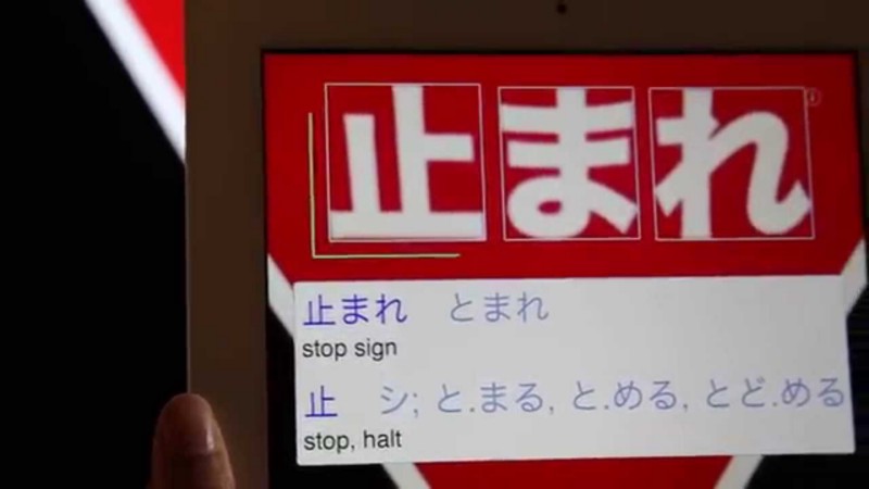
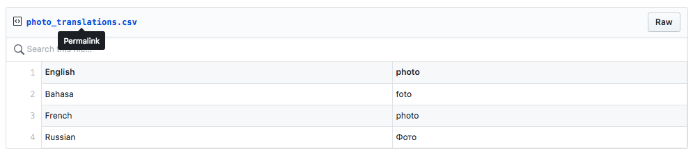
Consider the translation for word “picture” in different languages:
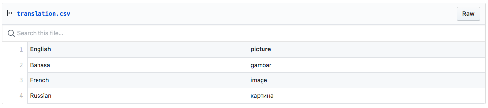
Notice how the count and heigh of characters varies a lot for different languages for the same word. Now if we replace the word picture with an equivalent word “photo”, this is how the translations look:
Culture considerations: Because localization goes beyond translations
An interesting case study in localizing an app for a region is the default stock market app on iOS:
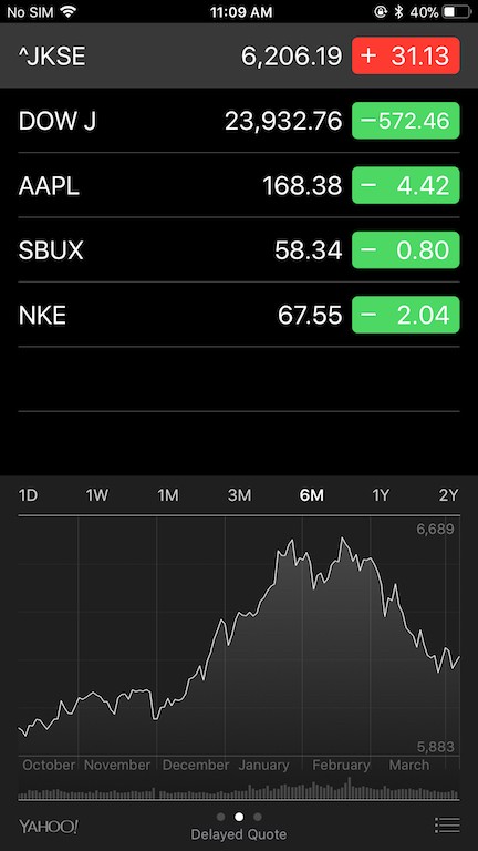
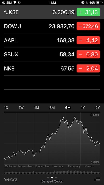
Notice the subtle difference in the default Stock App on iOS if region is China (left) or not (right)
Chinese consider the colour red to be auspicious, hence the colours are switched for Chinese users to indicate positive stocks.
Thus, if you are building an app which would be made available across nations, it’s always a good idea to take into account the variation in cultures, apart from simply translating your strings.
Colours
colorify.it is a free tool by which you can analyse the dominant colours present on a website. I decided to use it to determine the dominant colours on the App Store page for the Top Grosssing Apps (https://www.apple.com/itunes/charts/top-grossing-apps/). Here’s what I found:
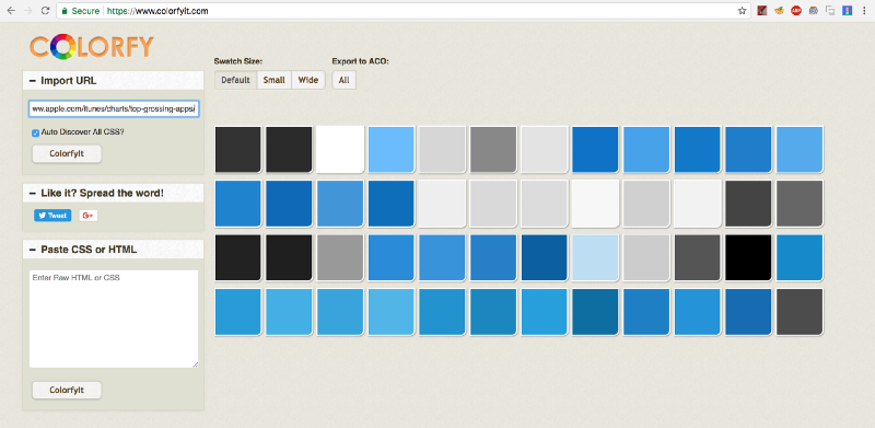
A whole lot of Blue!
Blue is the colour of choice for a whole bunch of top rated apps. And there is a sound reason for it. According to several research papers, the colour “blue” signifies qualities like calmness, relaxation and friendliness. Thus, it becomes important to utilise the colour pallets to help users understand the intent behind the actions made available to them in your app.
However, it is also important not to go overboard with colours. 1 in 12 men and 1 in 200 women across the world are colour blind. Thus, important sections in your app should be accompanied by a textual or graphical context, rather than purely relying on colours to convey the meaning.
Contrast
Probably the most confusing part for a developer is to decide which colour combinations should be used in displaying various UI elements.
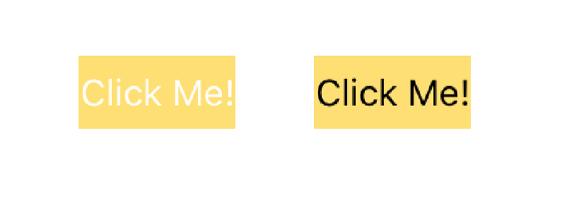 Which one looks better?
If you think that the button on right looks better, you are in sync with Apple’s suggested guidelines for colour contrasts. The button on the right has a contrast ratio of nearly 9.6:1 which is inline which Apple’s suggested minimum contrast ratio of 4.5:1. Having appropriate contrast levels enables users to clearly distinguish between various UI elements.
Avzhi Morag, a localization expert at Apple, shared a very valuable piece of advice with us :
Localisation is a form of accessibility.
Just like high-contrast modes or modes which magnify your screen allow users to use or access your app, localisation enables people to use you app if they do not speak your language. Colours and contrasts tweaked according to the user-base enable people to access your app in a way which makes them comfortable.
Formatters to the Rescue!
The localization techniques baked right into iOS can be tapped to produce more consistent, easy-to-manage localized strings. So it’s important to leverage them to smoothen out your localization process.
For example, while my name is written as Ravi Tripathi in major regions of the world, some countries, or even specific regions in a country, follow different convention. Thus my name should be displayed as Tripathi Ravi if say, my app were to be distributed in Japan.
Thus, it’s a good idea to use the PersonNameComponent formatter to get the job done. Just assign the components of a user’s name and your app would reflect the naming conventions used in a region.
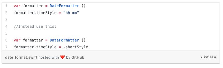
It’s also important how you would use a formatter. For instance, it’s always a good practise to use in-built formats, rather than hard-coding it.
Another use for localization aware formatters is when dealing with measurements and units. You can add, subtract or perform any other arithmetic operation on different measurement scales by using Measurement classes, which allow hassle-free unit interoperability.
XLIFF : The Polyglot’s format
Any discussion on iOS localization tricks is incomplete without XLIFF. It’s an is an XML-based format by which you can store and share translations without hassle. XCode provides an easy method for updating your app with appropriate localized strings. All you need to do is export your existing translations as an XLIFF file. You can then pass it to a translator, who can update it with new translations, which you can then re-import to update your translations. As this is a globally accepted standard, and does not require any coding skills, it essentially separates the job of translators and coders, making it easier for them to focus on what they know the best.
For a more clear insight on how to use XLIFFs in you projects, check out Apple’s official documentation here.
Also published on Medium.